As a subcriber of Safari Books Online for more than two years, i will share my personal opinion about the new interface of safari books online. We will compare the current safari books online (my.safaribooksonline.com) with the all new interface of safaribooksonline (safaribooksonline.com). Let’s get started.
What’s good on the new safari books online
- Clean interface, responsive, and compatible on many browser
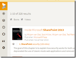
- Quick search and seamless searching experience between video and book
- Recommendation system based on the reader interest
- The semantic usage of reader. For example, what section that become favourite on certain books, or how long reader will read the section of the book
- Modern video player
What’s wrong with the new safari books online
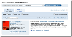
- Limited collection, I search the same query between old and the new interface. Guess what the new interface has differeny content about my query “Sharepoint 2013”


- NO favorite folders only Queue. So you can’t move your collection into a specific folder. It will become a problem if you have many subject to learn


- No support for exploring a book by years of publication. For example, you want to get a latest definition about e-learning. In the past, I just click the left side filter fo publication years but with the new interface of safari is somewhat impossible.
- No economic option for student, unemployee, or lecturer. The subscriptions cost ~200-300$, in the old safari you have 100$ option through a bookshelt model.
- The lack support of Windows Phone, Android, and Windows 8.1 client.
Verdict – upgrade now or later?
I love how Safari books structure the book on a new model. however, they forget how digital library is structured. is just like one step ahead, but two step back. If you are a book lover, the new upgrade is a must, but if you have limited budget. Keep your old safari till you need to access full library. trust me, 200$-300$ years is worthed with the Safari